Community organizers in a mid-size city keep their groups on Facebook, in group chats, and on paper flyers. None of that is self-hostable. A venue that loses its Facebook page loses its calendar, its followers, and its history in the same afternoon, and it has no copy of any of it.
Screens
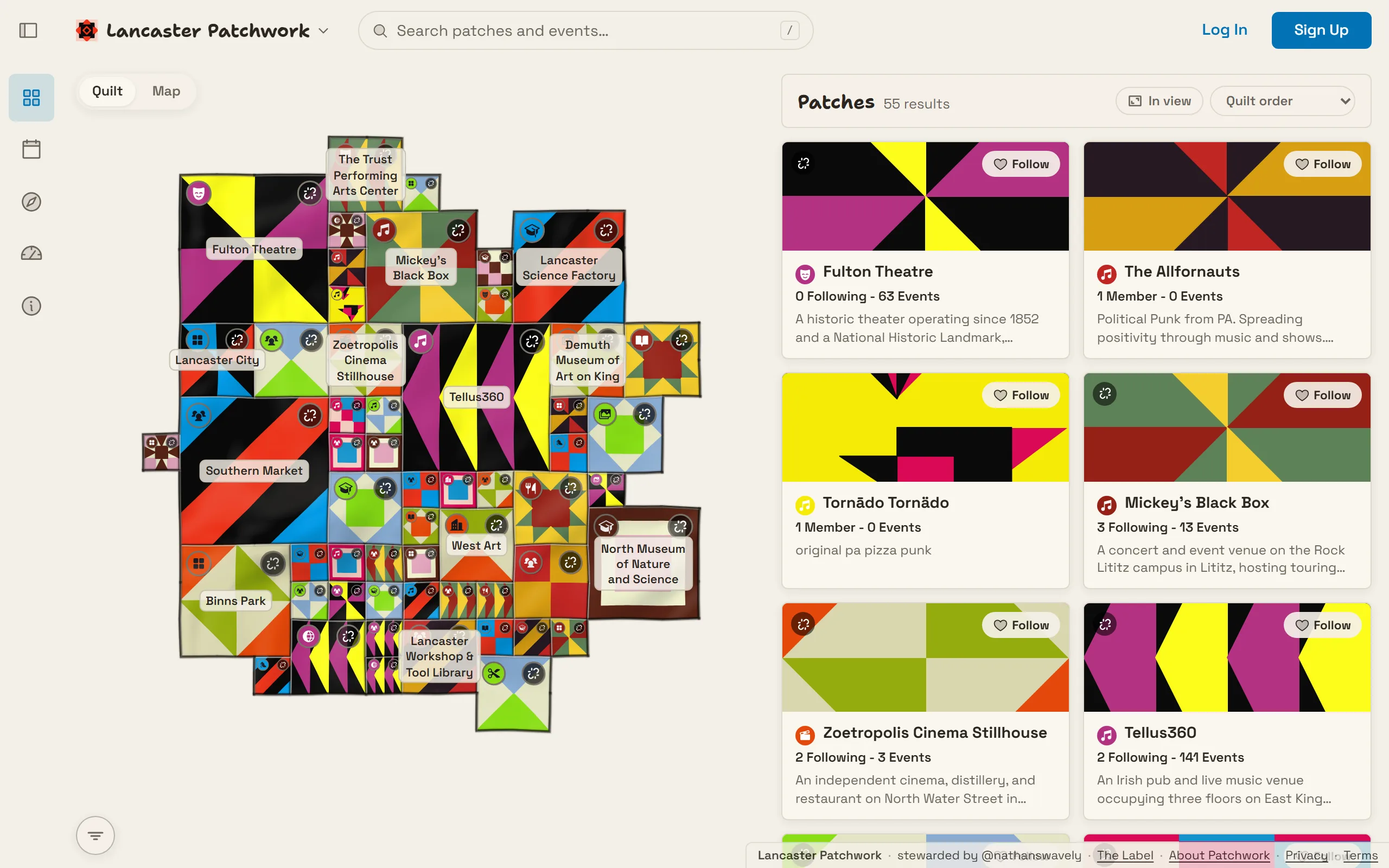
The quilt and the patch list, sharing one desktop screen.
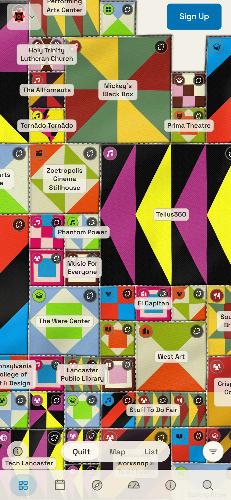
The same screen on a phone. The list becomes its own view behind the pill.
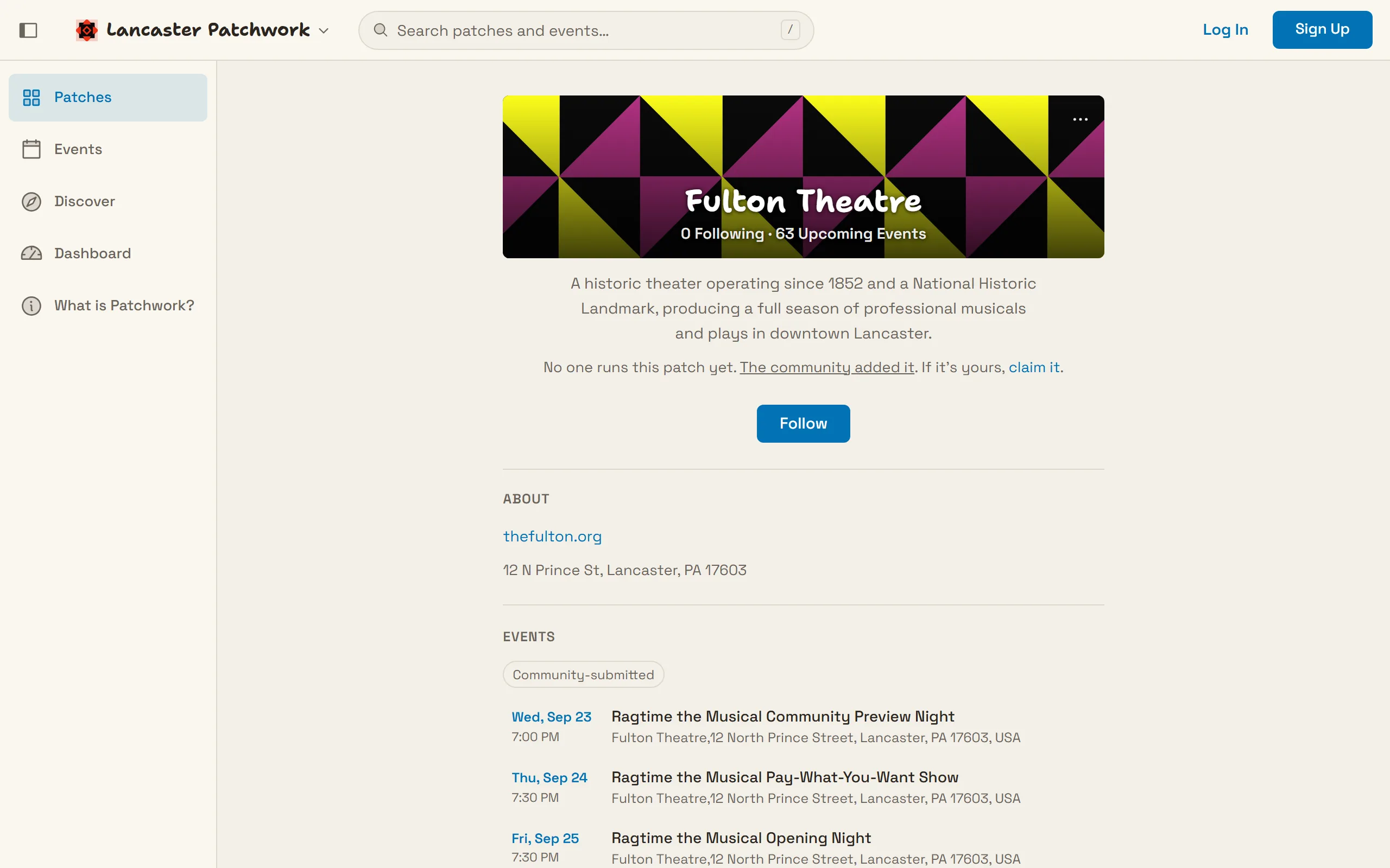
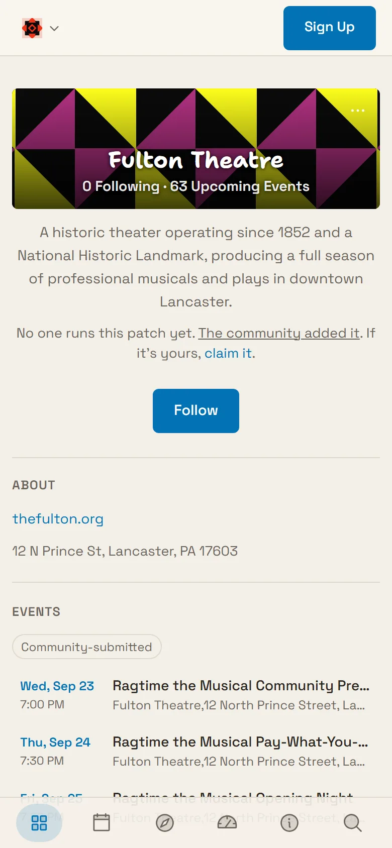
A patch page. Name and counts on the cover, then only the sections that have something in them.
The same patch page on a phone. The cover shortens and the sections stack.
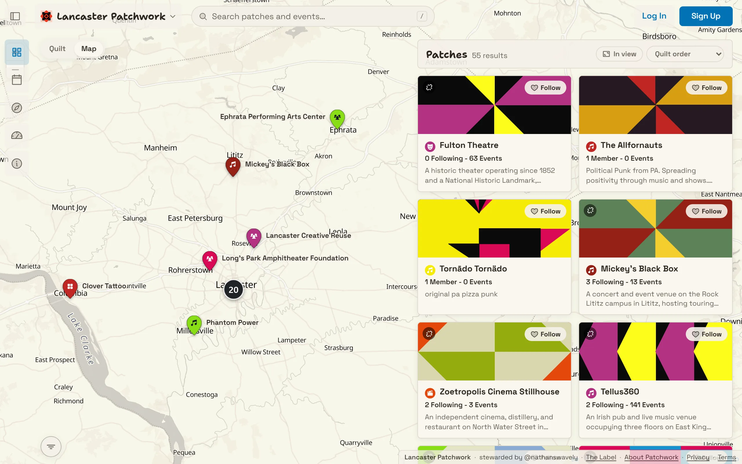
The map view. Same groups and same list, placed on streets instead of by shared membership.
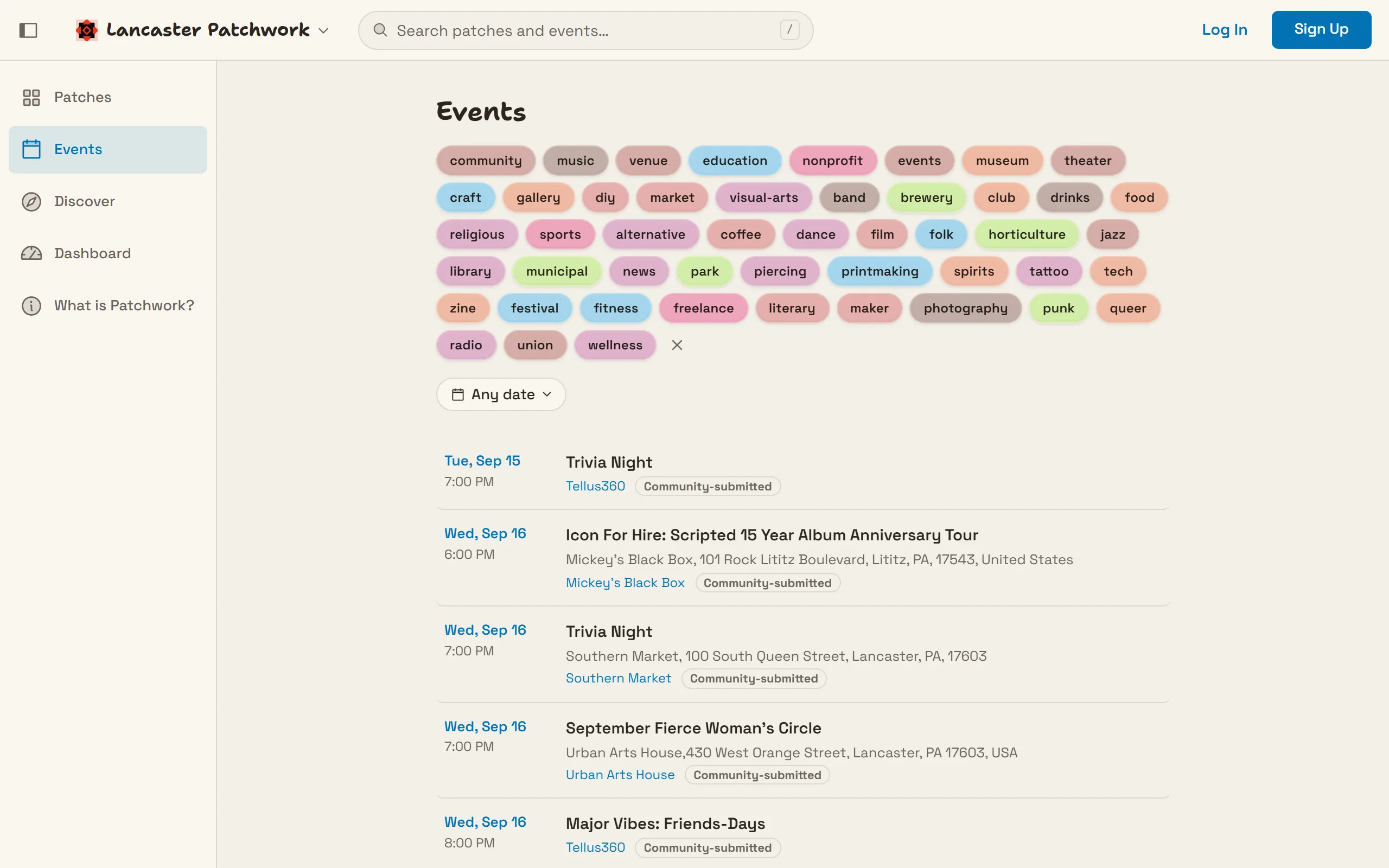
The city-wide event list. Every patch posts into it.
Design decisions
The quilt and the list are one screen
The quilt is a treemap of every public group. A tile's size comes from how much the group does. Its position comes from how many people it shares with its neighbors. Nothing about the layout is personalized, and nothing is ranked.
A treemap alone fails the visitor who arrived knowing the name of one venue. So the patch list floats over the right 45 percent of the canvas and scrolls on its own. Spatial browsing and name scanning are both on screen at once. There is no mode to switch.
Counts get one line and no icons
Every tile carries a single small line under the group name. It reads 14 Members · 6 Upcoming Events and nothing else. An icon pair would have taken the same vertical space and said less at a glance. Below it the description clamps to two lines, so tiles stay the same height no matter how much a group wrote about itself.
The follow button sits in the corner of the tile's cover art instead of in the body. That keeps it off the count's line entirely. The count's wording changes with the group's state. A group nobody has claimed yet has followers rather than members, so its tile says Following.
Both halves are server totals. An earlier version counted the event rows the page had already loaded, so a venue with forty shows on its calendar advertised five.
A group page shows only what it has
The cover holds the name and the two counts. About, Events, Members, and Governance follow, and each one renders only when it has content or when the person looking at it can add some. A three-piece band never sees a Governance heading. Nobody has to be told why an empty section is on their page.
The same reasoning took out passwords. Signing in is an invite link, a magic link, or a passkey. An organizer's first act on the platform is not inventing a credential, and a self-hosted instance does not need a mail server to get its first admin in the door.
Mobile moves the switch into the thumb
Tiles drop from two columns to one at 1024px, well before the phone breakpoint. The narrow pane made two columns illegible long before the layout was actually mobile.
On a phone the quilt and the list stop sharing the screen. A Quilt, Map and List pill takes over, and it sits low, in the bottom third, where a thumb reaches without a grip change. It is the only control on the page that moved position rather than just shrinking. The pill is fixed to the viewport rather than to the pane, because a pane sized in dynamic viewport units and a fixed element do not resolve against the same box on iOS. Matching the offset alone was never enough.
What it runs on
Patchwork is a single Go binary with a SQLite file behind it and a Svelte front end, small enough to run on a Raspberry Pi. Any community can deploy its own; the first one is live for Lancaster, PA.